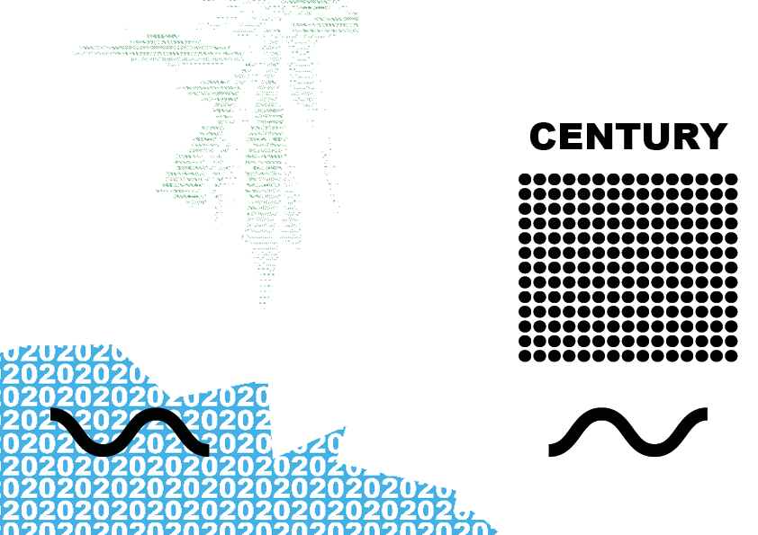
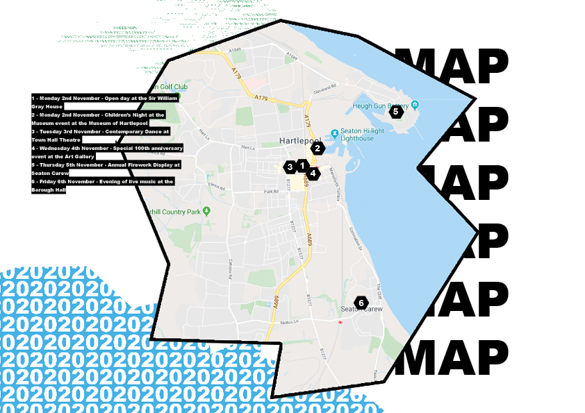
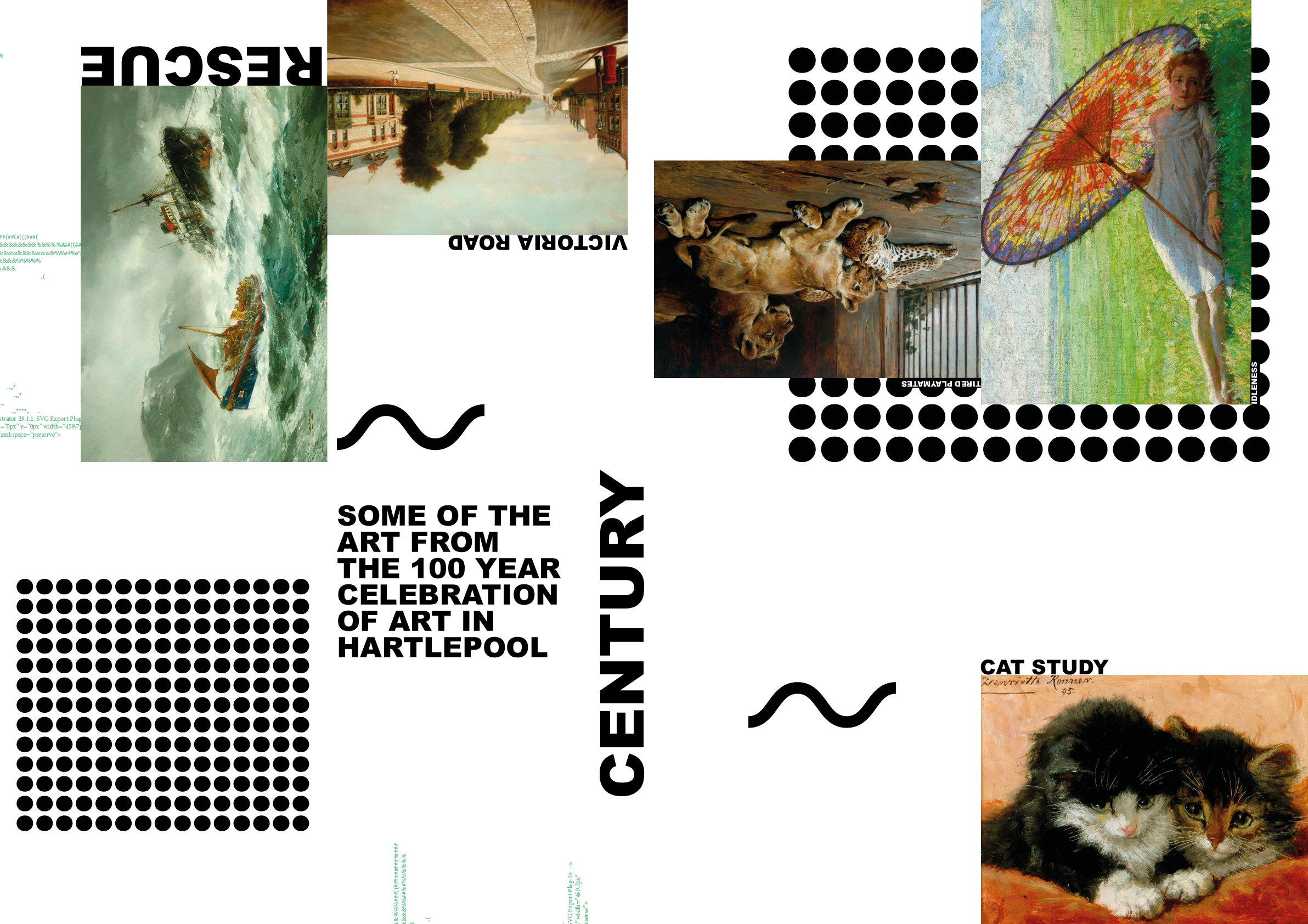
CENTURY
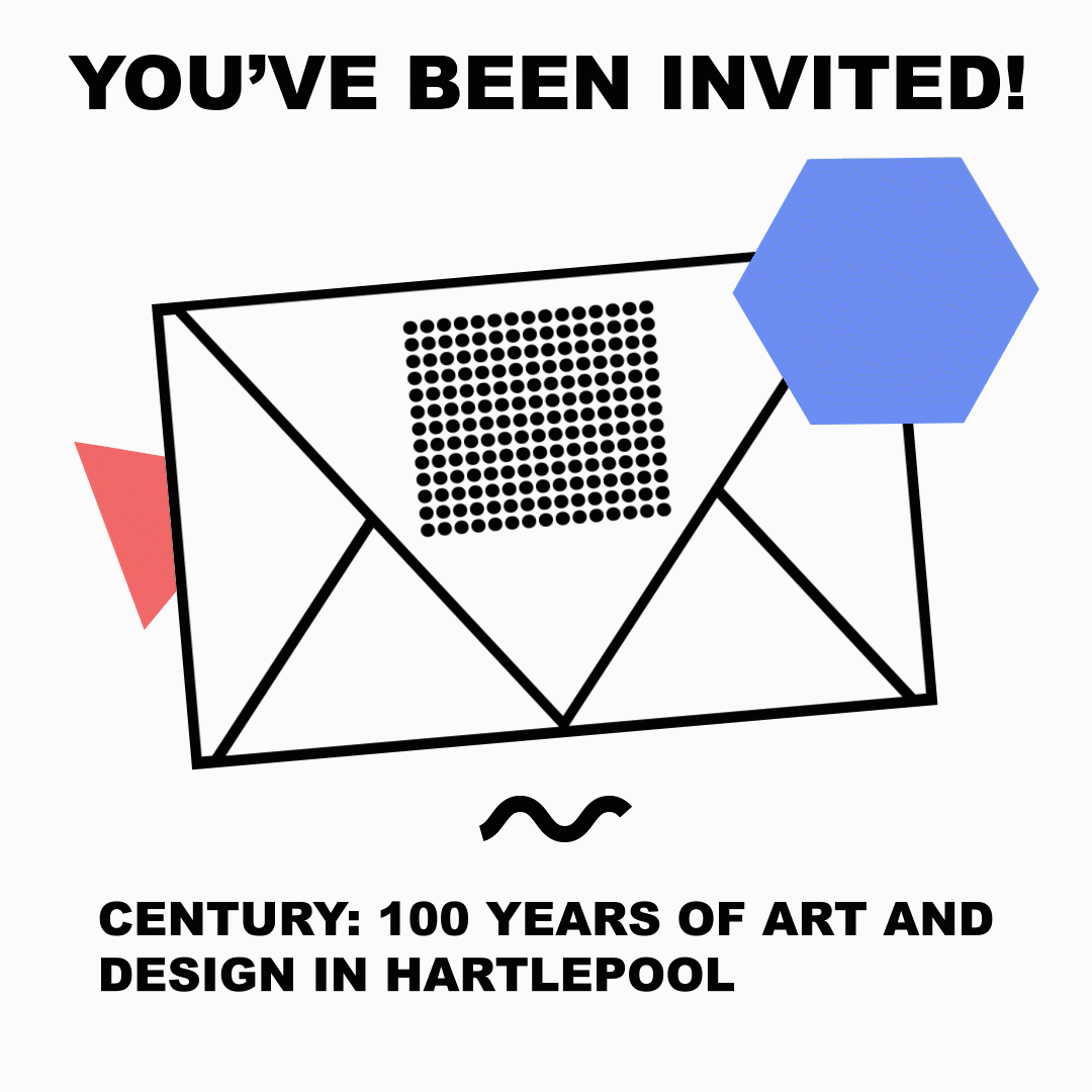
Century (2020) was a project that fulfilled a brief* from Hartlepool Council that required branding work for a then upcoming exhibition of 100 years of art and design from the local area.
My main goal with the branding was to create something that spoke to the Hartlepool area, put the timescale of the event into perspective, and instilled a feeling of excitement and energy to get people excited for the event.
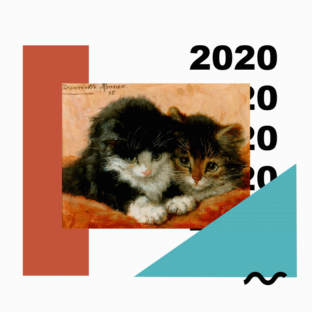
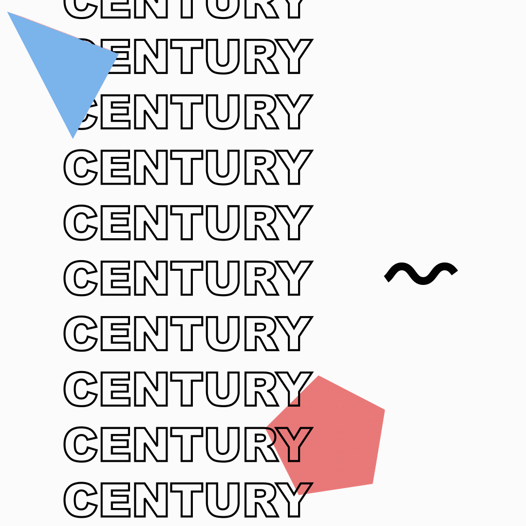
I came up with several visual motifs that worked to complete all of these goals: a constantly wiggling line to evoke the waves that surround the coastal town, a set of 100 dots to symbolise each year in the exhibition, and a playful streak to all of the outcomes, from unexpected and unconventional layouts to physics based, kinetic motion graphics segments.
I used ascii art to further break things down into small segments, with shapes emerging from the many small shapes and becoming fully formed overtime, much like the history of this town’s art and design is made up of small events and pieces that eventually led up to the exhibition itself.
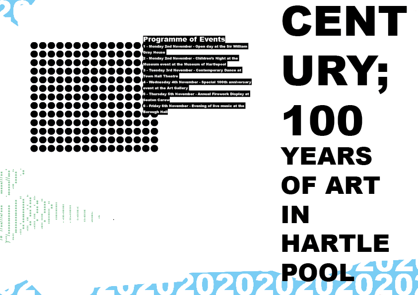
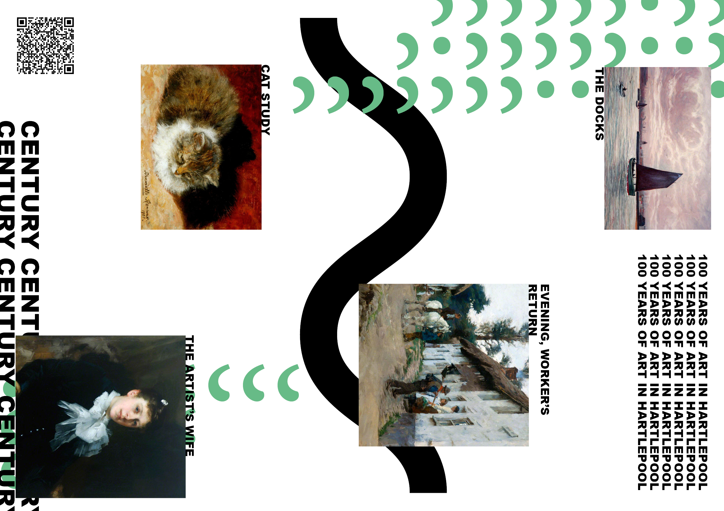
Work from a brochure, and a posterzine for the event
Digital mailouts and the trailer
The project had several different outcomes, ranging from signage and brochures, to digital mailouts and motion work.
The digital mailouts would be attached inline to emails, and were designed to be immediately striking, with colourful shapes and movement.
The largest piece of motion work was a 36 second long trailer that was designed to be played on a loop, which gave details for every event throughout the exhibition.
By far the largest part of the project was the 62 page brand guidelines I wrote for the exhibition, with detailed rules and explanations for the conception and use of each motif I had designed for the project.
Download the Century brand guideline as a PDF.
*This project was a live brief given to me and many other
students during university. My work was ultimately not selected.